

Contenido
Affiliate link placement is one of the most overlooked parts of affiliate content. You can choose the right product, write a strong post, and still leave clicks behind – because the link sat in the wrong spot.
A link that arrives too early shows up before the reader knows why the product matters. One placed too late gets skipped by everyone who left before the end. And a link buried inside a dense paragraph gets missed even when the product is a perfect fit.
This guide covers the placement decisions that change how many people actually click: when to introduce the first link, how to choose between text links, buttons, and product boxes, how many links are too many, and which parts of a post pull the most clicks.
Place Your First Affiliate Link After the Reader Understands the Product
The instinct to get a link in early is correct. Reader drop-off is front-loaded – a first link that lives in the bottom half of the article is already working with a smaller audience.
What does not make sense is early placement without context. A link dropped into the second paragraph, before the reader understands what the product is, what problem it solves, or why it belongs in the post, will get skipped. The reader has no reason to click yet.
The first link should appear within the first 25% of the post, but only after the product has been introduced and its relevance established. In a 2,000-word article, that window lands somewhere in the third or fourth paragraph – after the problem has been framed and the product has earned a mention.
Context before the click matters because it changes what the link represents. A link that appears after the reader understands the product is a next step. A link that appears before they do is just a hyperlink.
Use Product Names as Anchor Text, Not “Click Here”
When a product gets named in a recommendation, that name should be the link. Not “click here.” Not “find out more.” Not “this tool.” The product name itself.
The difference looks like this: “I use Kit to manage my email list” versus “I use a great email tool – click here to check it out.” The first version tells the reader exactly where they are going before they click. The second asks them to take a leap of faith on a generic phrase – and most won’t bother.
Filler anchor text creates an extra step in the reader’s head. They have to register that a generic phrase is pointing somewhere specific, then decide whether that destination is worth clicking. A linked product name removes that gap entirely.
There is a trust dimension to this as well. “Click here” signals that the link is being pushed. A linked product name signals that the recommendation is the point and the link is just how you get there. Readers feel that difference, even if they cannot name it.
The same logic applies when a product appears more than once in a post. Link the name on the first clear recommendation. If the product comes up again where the reader is closer to a decision, link it there too. What to avoid is linking every single mention – that turns the product name into visual noise rather than a signal worth following.
Add Affiliate Links Near Decision-Making Moments
Affiliate links do not generate clicks by simply existing in a post. They generate clicks by appearing at the right moment – when the reader is in the process of making a decision.
Writers tend to place links where the product comes up naturally in the writing. But where the product comes up and where the reader is ready to act are not always the same place.
In most posts, these are the places where a link actually earns a click:
- After a direct recommendation: “For creators who want a simple way to build an email list and send regular newsletters, Kit is a strong place to start” – the product name should be linked right there. The recommendation has been made, so the reader has a reason to click.
- Under a verdict or summary: If a review section ends with “Best for creators who want email marketing without a steep learning curve,” that is a natural place for a button or product link. The takeaway is clear, and the next step is action.
- Near pros and cons: A reader scanning pros and cons is in the middle of deciding whether the product fits. Place the link close enough that they do not have to scroll back up to find it.
- Beside pricing or value discussion: When you explain what a product costs, which plan makes sense, or why the features are worth paying for, the reader is already comparing cost against benefit. The buying question is active.
- After a tutorial step: If you show readers how to create a newsletter signup form in Kit, add the link after the step where the tool solves the problem. At that point, they have seen the product in action, not just heard about it.
- After a comparison: If Kit comes out ahead in a comparison, link it near the verdict. The reader has just seen how it stacks up against another tool, so they should not have to scroll around looking for the next step.
In every one of these spots, the reader is leaning forward. The link gives them somewhere to go with that momentum.
Where links consistently underperform is at the end of the post – used as a final send-off after the full argument has been made.
A conclusion-only placement strategy assumes most readers finish the post. Most do not, which means those links are working with a fraction of the audience that saw the opening.
That is why the conclusion should not be your first affiliate link placement. A reader who reaches the end is highly engaged – give them a final link there. But by that point, the strongest decision moments have happened. Use the conclusion as a last clear next step, not as the only place readers can click.
Use Text Links, Buttons, and Product Boxes Where They Work Best
Not every affiliate link should look the same on the page. The format – whether it sits inside a sentence, stands alone as a button, or gets built into a product display – changes how visible it is, how the reader relates to it, and how likely they are to click. Using one format across an entire post means some links will underperform simply because the format does not match the moment.
Text links belong inside the flow of content, where the recommendation is part of a larger explanation. If you are walking through how to set up an email sequence and mention the tool mid-paragraph, a text link on the product name is the right format. It fits the reading experience without interrupting it – it feels like part of the information, not a separate ask layered on top of it.
Buttons are for moments when the reading is done, and the action is the point. After a verdict section, a direct recommendation, or a pros and cons breakdown, the reader has enough context to act. A button gives them an obvious next step, and its visual weight signals that this is the moment to move.
Product boxes are built for recommendations that are the centerpiece of a section rather than a supporting mention. A product box showcases the image, name, key details, and CTA of a product, designed to be noticed rather than read past. A plain text link cannot do that same job when the recommendation deserves more than a hyperlinked word in a paragraph.
You can build a product box manually, but it is easier when your affiliate tool supports it. With the ThirstyAffiliates Product Displays add-on, you can turn a plain affiliate link into a product display and place it exactly where your strongest recommendation needs more visibility.
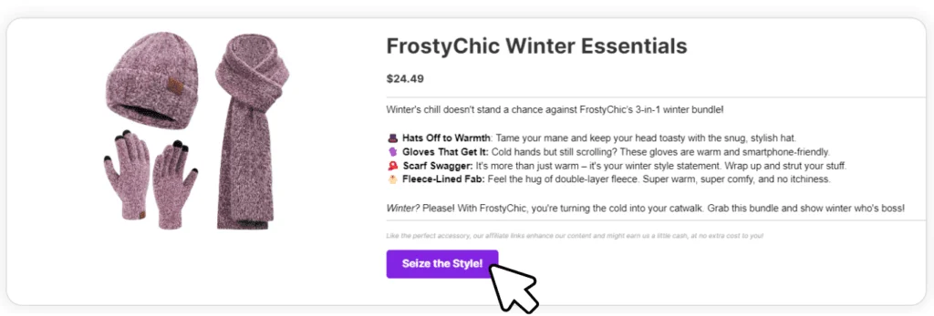
Use that format for the recommendation you actually want readers to notice: the winning product in a comparación, the top pick in a resumen, or the tool you just showed in a tutorial. Then place the display directly after the section that made the case for it, while it is still fresh in the reader’s mind
How Many Affiliate Links Per Post and When to Repeat Them
There is no universal number of affiliate links that works for every post. The right count depends on the post type, length, and how many products are actually being recommended. The format sets the limit.
As a working baseline:
- Reviews: Higher link density makes sense because the whole post is built around one product.
- Roundups: One link per product entry is usually enough.
- Tutorías: One link is often enough because the reader is following steps, not shopping.
- Comparisons: Link each product once inside its own section.
Repeating the same product link is not a problem if each repeat appears at a new decision moment. Before adding a second or third link, ask: is the reader in a different place now than they were at the first mention? If yes, the link earns its spot. If the product is only being named again without new context, leave it unlinked.
Over-linking is usually easy to spot. If the same product name is hyperlinked in five consecutive paragraphs, the links stop reading as recommendations and start fading into the page. Readers notice them less, not more.
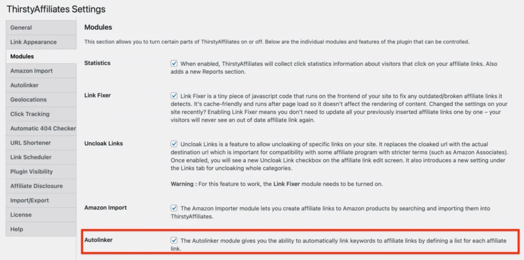
Aquí es donde ThirstyAffiliates Autolinker helps. If you have already published dozens or hundreds of posts before adding a new affiliate product to your stack, you do not have to go back and link every mention by hand.
Set the keyword once, and Autolinker can apply that affiliate link across your existing content. You can also set limits, so one repeated keyword does not turn into ten affiliate links in the same post.
Match Affiliate Link Placement to the Type of Blog Post
The right number of links is only part of the decision. Placement also depends on the type of post you are writing. A review, roundup, comparison, tutorial, and alternatives post all move the reader toward a decision in different ways, so the links should not sit in the same places.
- Reviews: Place links where the reader is actively evaluating the product: after the first clear recommendation, inside the feature section, near the pricing or value discussion, and at the final verdict.
- Roundups: Place one link inside each product entry, usually on the product name or near the “best for” line. Readers scan roundups quickly, so the link should be close to the point where they understand what that product is good for. For the top recommendation, a product box can work better than a plain text link because it gives the pick more visual weight.
- Comparisons: Place links near the comparison table, inside each product breakdown, and close to the final verdict. The verdict is the strongest placement because the reader has just seen which option fits better.
- Tutorías: Place the link at the step where the product is actually used. That is the moment the reader sees the tool solve the problem, so the link feels useful instead of promotional. Other mentions can usually stay unlinked.
- Alternatives posts: Place the link right after the section explains who each alternative is best for. The reader is looking for fit, so the strongest click moment comes when they recognize, “This one sounds like me.”
Conclusión
Affiliate links work best when they show up at the moment the reader is ready for them. Not before the product makes sense, not after the strongest decision point has passed, and not so often that the link becomes easy to ignore.
Placement rarely requires rewriting a whole post. Most of the time, it means looking at where your links already sit and moving them closer to the moments where readers are actually deciding what to do next.
Before publishing, run through this:
- First link placement: Does the first link appear after the reader understands the product and why it is relevant?
- Anchor text: Are product names linked rather than filler phrases like “click here” or “find out more”?
- Decision moments: Are links placed near recommendations, verdicts, pricing discussions, and comparison conclusions – not just where the product happens to be mentioned?
- Format: Are text links, buttons, and product boxes each being used at the right moment, or is every link the same format regardless of context?
- Link count: Does the density fit the post type, and does every repeated link appear at a new decision moment?
- Post type: Does the placement logic match the format – review, roundup, tutorial, comparison, or alternatives post?
ThirstyAffiliates is built to make this manageable at scale. The Autolinker keeps important product mentions linked across your site without manual updates to every post. The Product Displays add-on gives your strongest recommendations a format that is harder to scroll past than a hyperlinked word. Together, they handle the execution so the decisions that actually require judgment stay with you.
Not using ThirstyAffiliates yet?












Deja una respuesta
Lo siento, debes estar conectado para publicar un comentario.