Contents

In the world of affiliate marketing, conversions are the name of the game. But how can you stand out and look attractive to customers so you can make those sales and actually increase your conversions?
In this post, we’ll share with you five simple things you can do to improve your conversion rate and generate more income. Let’s get started!
Build a successful affiliate business with ease using ThirstyAffiliates – get started today!
What Does “Conversion Rate” Mean?
Your conversion rate is the percentage of all visitors to your site who convert into customers or complete a task, such as submitting an online form.
To figure out your conversion rate, take the number of visitors who’ve become customers or completed a specific task and divide that number by the total number of visitors to your site.
For example, say 1,000 people visited your site and you earned 100 conversions — 100 divided by 1,000 equals 0.1, or 10%.
Why Does Conversion Rate Matter?
Your website’s conversion rate matters because it is literally the measure of your success. It tells you how profitable your business is and where your strengths and weaknesses are in terms of sales.
Using conversion rate data, you can see and understand what is and isn’t working on your website, how customers interact with different pages on your website, and why they are or aren’t converting.
You can then make changes to your site (conversion rate optimization) to improve site experience and boost conversions across the board.
Simple Ways To Improve Your Conversion Rate
Following are five of the easiest and simplest ways you can go about improving your site’s conversion rate without having to invest too much time.
1. Eliminate Unnecessary Form Fields
Using forms that are long and drawn-out for no good reason is a surefire way to turn people off and keep them from converting.
But longer forms aren’t necessarily bad. The trick is to be intentional about the questions you include in your forms. Think about what you’re trying to achieve with your forms, then include questions that are necessary for purchase or that allow customers to get their point across.
For some great advice on the very nuanced topic of form optimization, check out this Venture Harbour article on form length and conversion rates.
2. Include Reviews And Client Logos
On your website, it’s always a great idea to include reviews from actual people and businesses who use your product or service. These reviewers can help communicate your best qualities to site visitors and also help them determine whether they’ll benefit from what you’re selling.
This same idea applies to client logos. If an individual visits your website and notices that a well-known organization or brand works with you, they’ll be more likely to give you a shot.
Use the fear of missing out (FOMO) to your advantage!
3. Strengthen Your CTAs
Pay close attention to the CTAs, or calls to action, on your website. Are they generic? Are they placed prominently or are they easy to overlook? Do they inspire visitors to take action? If not, take some time to strengthen them.
In your CTAs, it’s important to communicate exactly what you want site visitors to do. For example, use phrases like, “Click Here” or “Sign Up”. It can also be effective to word your CTA copy in full, direct sentences such as, “Yes, I want this free guide!” or “I need this product – sign me up!”
The key is to make your CTAs visible, clear, and direct.
4. Add A Countdown Timer
Another excellent way to generate FOMO and give your customers a sense of urgency is to include a countdown timer on your website alongside your offers and CTAs. Timers make customers aware that your offer won’t be available forever.
The timer doesn’t have to be obnoxiously large, but make sure it’s placed where your customers can’t miss it. Also, consider using brighter, bolder colors to make it stand out.
There are all kinds of timer apps available out there, but we recommend you check out the options available through Optinmonster.
5. Showcase Live Purchases

Speaking of FOMO, a particularly powerful way to draw customers in and make them want to buy from you is to use a tool that shows purchases happening in real-time. Customers are profoundly influenced by the belief that other people are willing to give a product a try.
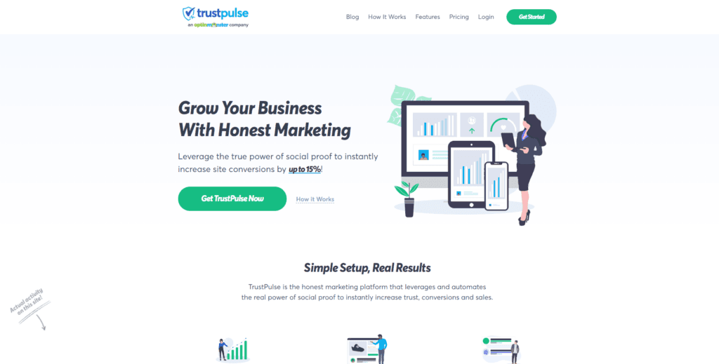
TrustPulse is one such tool that we highly recommend. It’s a simple addition to your WordPress site that is easy to use and can make a significant difference in your conversion rate.
Start building an online affiliate business that you can be proud of with ThirstyAffiliates – sign up today to get started!
Final Thoughts
As an affiliate marketer, understanding your conversion rate is essential to the success of your business. So always remember the formula:
Conversions ÷ Total Site Visits = Conversion Rate
And be sure to keep these tips in mind to help you improve your website, boost conversions, and increase income for your online business over the long haul.
- Eliminate unnecessary for fields
- Include reviews and client logos.
- Strengthen your CTAs.
- Add a countdown timer.
- Showcase live purchases.
To learn more about affiliate marketing, conversion marketing, and the business of affiliate marketing, check out our posts on how to track online conversions, social selling tactics that will help grow your audience, and copywriting power words every affiliate marketer should know.


I have to tell you that your content is absolutely top notch.
These are some good tips. Yes, improving the conversion rate is very important to generate more affiliate sales and income.