

Contents
Writing the perfect call to action (CTA) can be a challenge. It’s often hard to tell whether your CTA is working – especially in the context of a larger body of content. Since your audience is inundated with sales materials every day, how can you know whether your directive stands out?
Fortunately, by looking at examples of effective CTAs, you can get a better feel for writing an appropriate directive for your website. Then, you can experiment with different CTA styles to improve your marketing efforts and increase your conversions.
In this article, we’ll explore what a CTA is and why it’s essential. Then, we’ll explore four of the most compelling CTA examples from some of the most successful companies online. Let’s take a look!
What is a Call to Action?
A CTA is a line or two of text that tells your readers what you want them to do. It is written in the active voice and aims to excite users and prompt them to convert.
For example, some are some common CTAs:
- Buy now
- Call now for a quote
- Sign up for our newsletter today
A CTA can take many forms. It could be written text at the end of your blog posts, asking your readers to leave comments. Alternatively, button-based CTAs can prompt customers to purchase items from your ecommerce store.
How to Write an Effective CTA
A compelling CTA is one of the best ways to improve your conversion rate. This principle is particularly true if you present your CTA in a button format, which can increase click-through rates by up to 70%.
When writing a CTA, you should ensure that it is simple, direct, and noticeable. Readers should never wonder what they should do next. Likewise, you should consider focusing the surrounding content on driving the user to the CTA.
Furthermore, you should consider personalizing your CTA to your brand. Your target audience might prefer more formal or casual language, for example.
Finally, you might want to use A/B split testing with any new CTA. By doing so, you can establish which directive is most effective with your customer base.
4 Call to Action Examples to Inspire Your Marketing Efforts
Often, the best way to write a great CTA is to look at other marketing campaigns. When considering these examples, try to see them from the viewpoint of your customers. Then, you can consider adopting some of the same strategies in your marketing efforts.
1. Shopify: Start Free Trial
Shopify is an online commerce platform for companies looking to start selling online. Its primary CTA is a “Start free trial” button:

The “free trial” CTA is effective because it provides a clear value proposition. It enables the user to try out the service without a commitment. Ideally, the customer will commit to the service before the free trial ends. Shopify further coaxes readers to open accounts by reassuring them that no credit card is needed.
This CTA is also compelling because it’s conspicuous. It uses a green button format that contrasts with the pale background of the Shopify homepage. As such, it’s difficult to miss when reading the website’s content. You might want to use similarly contrasting colors with your CTA.
Furthermore, the CTA sits at the top of the page. Therefore, readers will see it immediately when they first land on the homepage.
Finally, the “Start free trial” CTA doesn’t require much information from readers. The box simply prompts users to enter their email addresses and click on the button. We also recommend limiting the amount of information you request from your customers to increase conversions.
2. Bluehost: Free Consultation
Bluehost is a hosting service that provides website hosting, managed WordPress hosting, email accounts, and domains. The company offers many different services and a wide variety of information.
Because of this, Bluehost aims to address any concerns with “Learn More” and “Free Consultation” CTAs:

While you can benefit from a clear CTA, it’s important to note that you can have multiple CTAs if your service demands it. Bluehost ensures that it will capture even uncertain users by providing that secondary directive. Therefore, you might consider adopting a similar approach if your brand offers technical or detailed services that can be challenging to understand.
Additionally, the Bluehost CTAs maintain brand consistency. They use a bright blue color that serves two purposes: standing out from the white background and reflecting the company’s signature blue shade. If your brand has clearly established colors, you might want to use them in your CTAs.
3. Netflix: Get Started
Netflix is a popular streaming service that doesn’t need to waste time getting to its CTA. Almost everyone already knows what Netflix is and what it offers. Thus, its CTA is pretty simple:
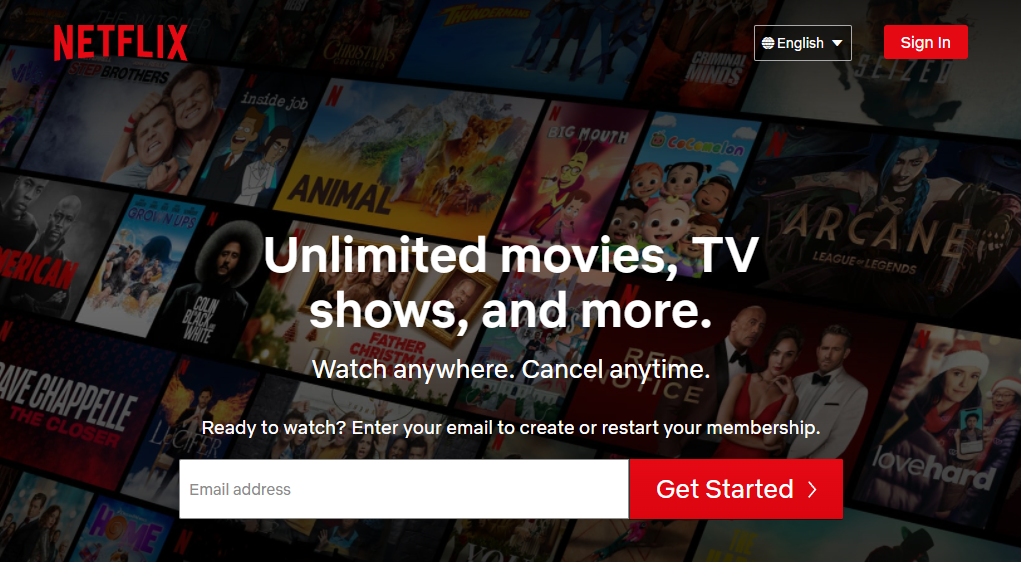
Netflix’s CTA starts with the value proposition directly above it: “Unlimited movies, TV shows, and more”. Below this, Netflix addresses potential concerns with another tagline: “Watch anywhere. Cancel anytime”.
Netflix has one of the most streamlined examples of a CTA. The user inputs their email address and presses a button, and they’re immediately engaged.
Furthermore, this CTA example relies heavily on color. It uses a bright red that fulfills a few purposes: standing out from the background, reflecting Netflix’s branding, and encouraging conversions.
Research shows that red CTA buttons perform significantly better than other colors, such as green. Red is often associated with excitement and passion, meaning that it could stimulate customers to convert and have emotional reactions to your business.
4. Lyft: Apply to Drive | Sign Up to Ride
Lyft’s popular ridesharing service has two CTAs: one for drivers and one for riders. Two competing CTAs can look messy, but Lyft makes it work:
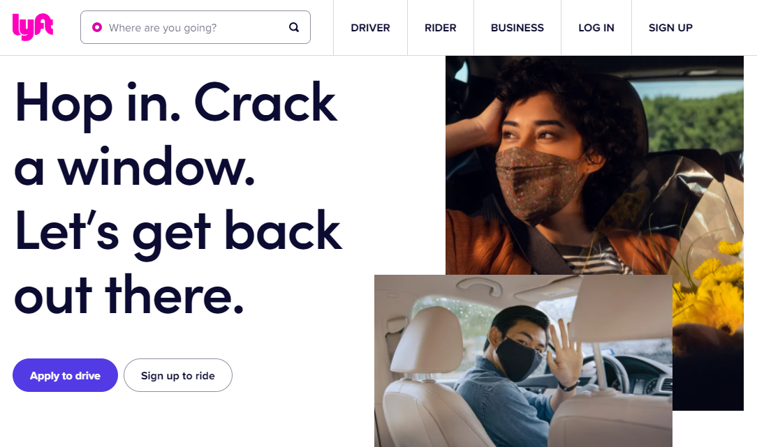
The default CTA is “Apply to Drive”. However, there’s also a secondary CTA: “Sign up to Ride”.
This strategy is more clever than it might seem. Most users are used to a binary choice of “Yes” and “Cancel”. Therefore, this dual CTA encourages people to pick either option, both of which lead to further engagement.
You can adopt a similar strategy with your marketing efforts. Consider creating contrasting CTAs that lead users to different parts of your website. You might also use different colors to distinguish the two options and help them stand out from your background.
For example, you might contrast “Learn More” with “Sign up now!”. By doing so, you can convert some users instantly and prompt other people to keep learning about your products and services.
Conclusion
A Call to Action (CTA) doesn’t need to be perfect the first time you create it. However, your marketing efforts will benefit from a firm foundation. By examining successful CTAs, you can create the ideal directives for your brand.
In this article, we looked at four CTA examples and why they are successful:
- Shopify: Its “Start Free Trial” CTA offers clear value to readers and requires minimal input.
- Bluehost: Multiple CTAs help readers learn more about products before committing.
- Netflix: A brand-appropriate CTA contrasts with the background and incentivizes conversions.
- Lyft: Contrasting CTAs prompt users to select between two choices to learn more.
Do you have any questions about creating a Call to Action (CTA) for your marketing campaigns? Let us know in the comments section below!
If you liked this article, be sure to follow us on Twitter, Instagram, Facebook, and LinkedIn! And don’t forget to subscribe to our newsletter.


Leave a Reply
You must be logged in to post a comment.